Elevating Insights with Scrollytelling for MVP
I created dynamic reports for MVP, which are essentially data stories that guide users through a narrative while also allowing them to interactively explore the data—a concept commonly referred to as scrollytelling, a technique notably employed by The New York Times.
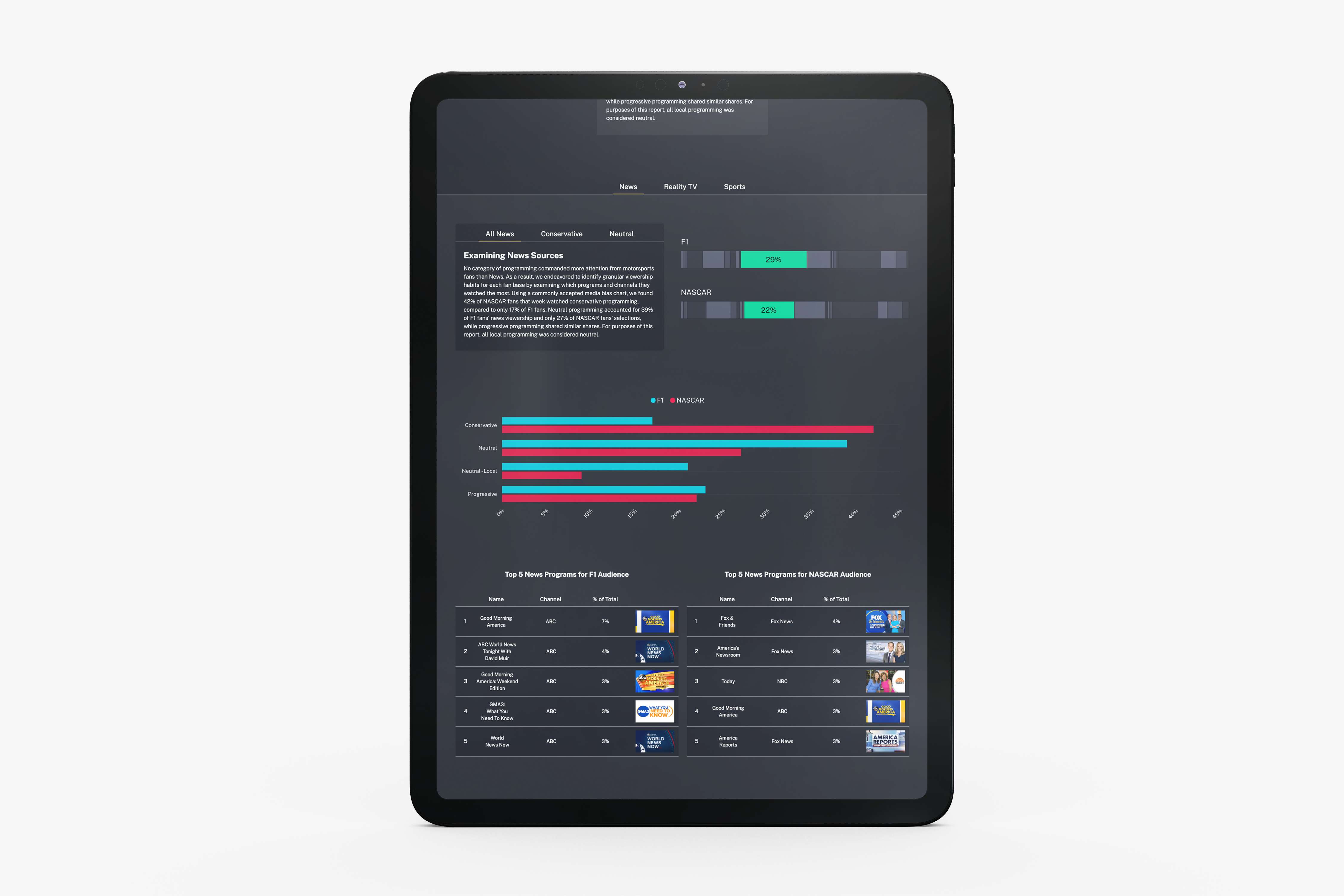
F1 VS. NASCAR: Audience Affinity Analysis
In this dynamic report, users can compare the audiences of F1 and NASCAR. We gathered profiles of all viewers of a NASCAR and F1 race and extracting the other broadcasts they watched during that week. Using this detailed data, we conducted a comprehensive comparison of the affinities associated with F1 and NASCAR audiences.
See the full report here
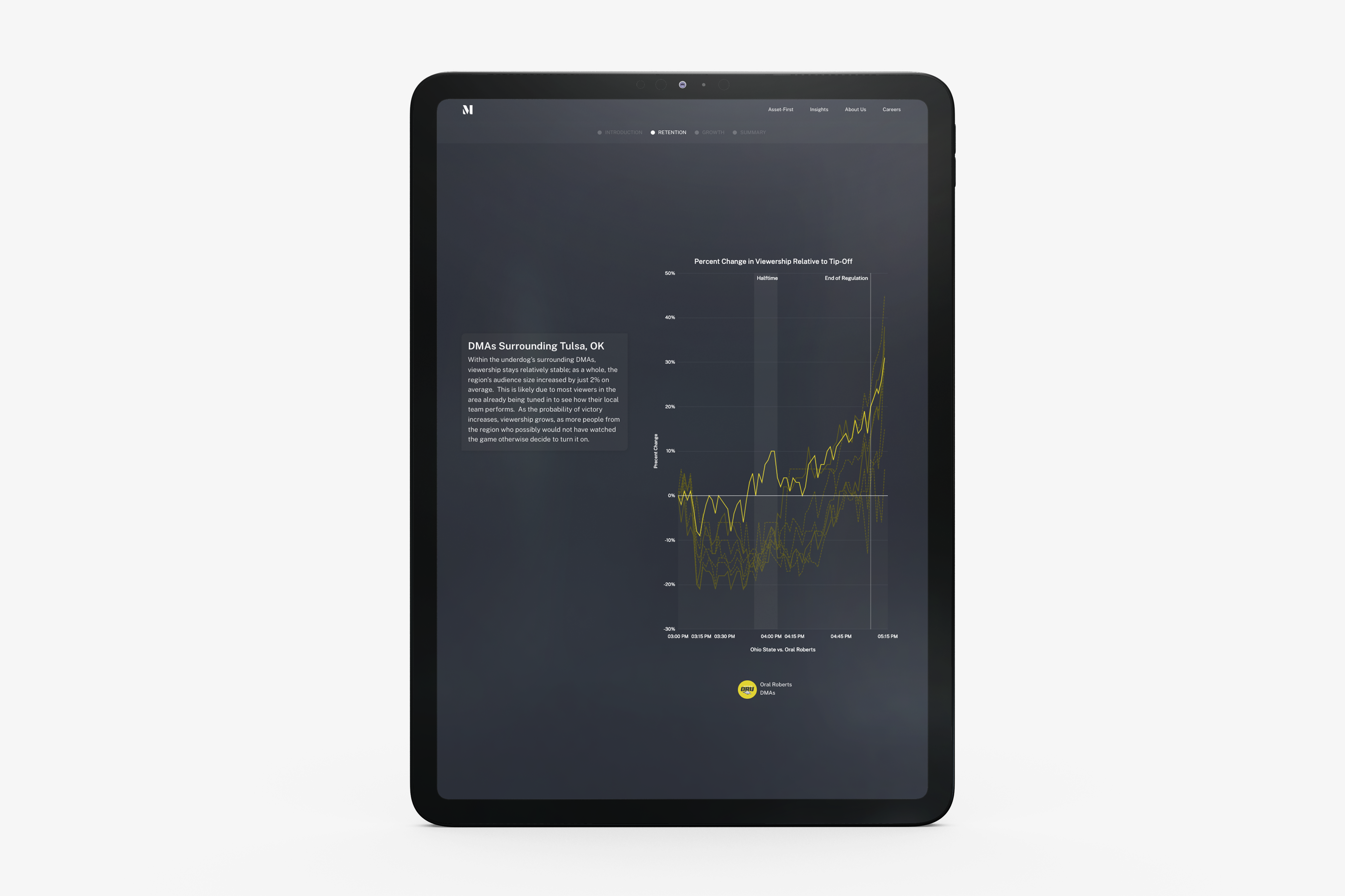
Impact of Upsets and College Affinity on Game Viewership
In this report, we analyze how an upset during March Madness pulls viewership from other games occurring simultaneously. Additionally, we examine how college affinity can impact viewership.
See the full report here
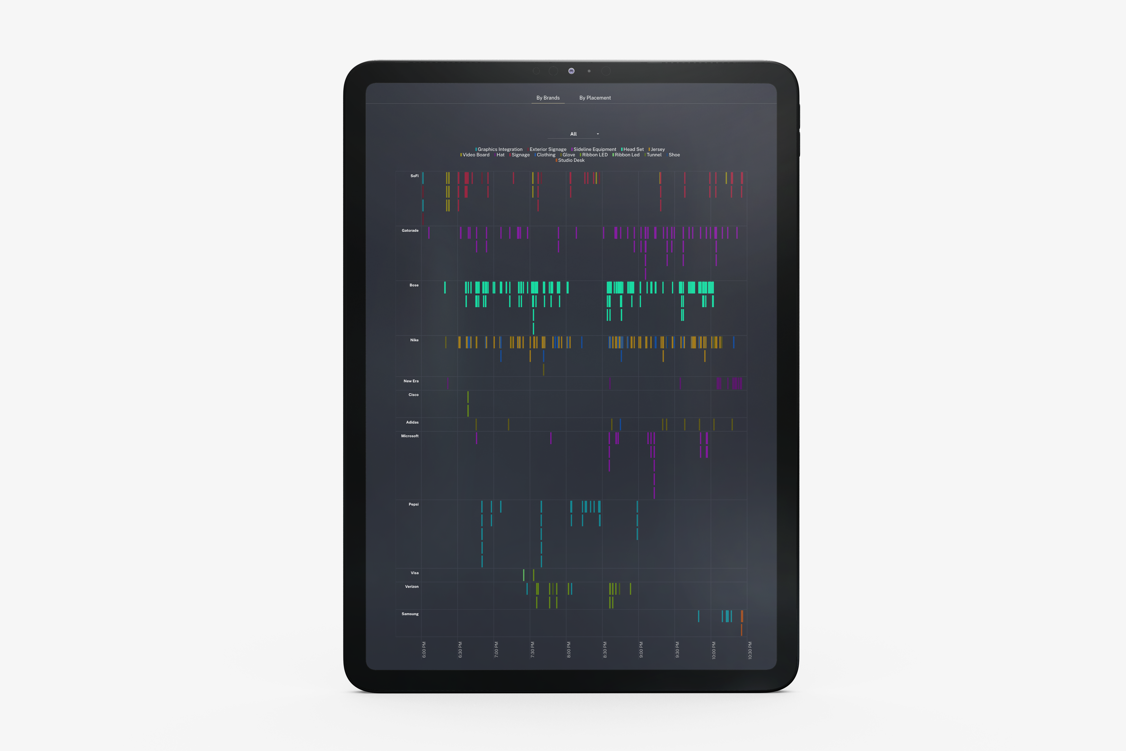
Analyzing the 18-Week NFL Season
An analysis of the 18-week NFL season, along with a detailed data visualization of the Super Bowl, allowing users to explore which brands were detected at what moment during this iconic eve
See the full report here

NBA Season Recap: Unveiling Affinity Levels, Market Impact, and Social Media Dynamics
A thorough recap of the NBA season includes an examination of both local and national affinity levels for each of the 29 U.S.-based NBA teams. This is achieved by comparing viewership in terms of total audience and market share. The report also delves into the impact of top partners on social media throughout the 2021-2022 NBA regular season.
See the full report here